From April 2019 we will have the new Bournemouth, Christchurch and Poole Council, which will be responsible  for local government services in all three towns.
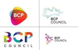
Four designs have been put forward for the new Council logo, and the current BCP Shadow Authority would like to hear what local residents think.
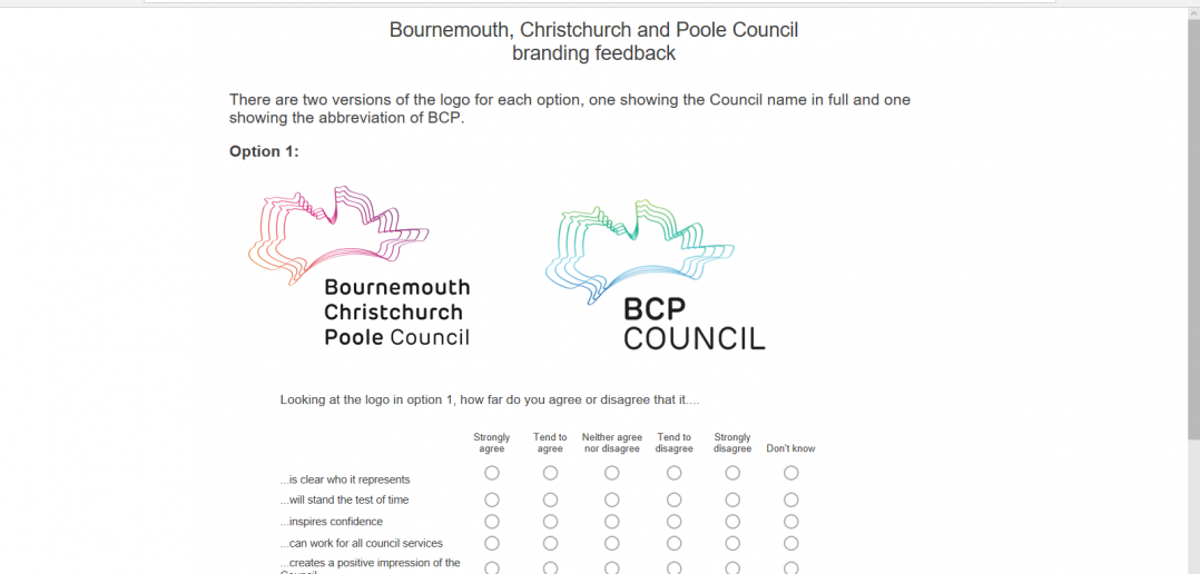
Have your say on the new designs here, before November 18. The survey takes less than five minutes.


3 Comments
Worth casting our minds back to London 2012. The much maligned logo during its conception that was arguably a success and a memorable identity. But everyone thought they could do better didn’t they? https://www.adweek.com/creativity/london-2012-olympic-logo-was-it-really-so-bad-after-all-142610/
I think asking for a logo to be approved via a public consultation is a recipe for disaster. Suddenly everyone is a branding expert. I am dismayed and disappointed by the very vocal council officials coming out with the predictable ‘it looks like it was designed by a child’ line. Far better to convey these sentiments to the agency who designed the logo and request improvements rather than publicly shame them. Work with them and give them a clear brief.
I am not defending the logos. I am not affiliated with the agency who designed them. I am just dismayed at the process and the predictable public outcry.
Now let’s talk about that terrible Conservative party logo next… any takers?
I disagree, I actually like them. Okay the top right quite frankly is the joke one but the rest are good, I voted for the bottom right in the end, the more I looked the more I liked it
Absolute rubbish!